Radiant Orchid: Friend or Foe!
January 16, 2014
Rest assured, Pantone is always going to go bold. Radiant Orchid follows other winners like Emerald and Tangerine Tango. Simple hues like whites and blacks will always be bridesmaids. That said, Radiant Orchid is a love-it or hate-it polarizing color. Personally, I’m warming up to the idea. Pantone’s proclamation is not random. They carefully observe color trends across the globe before the big, colorful reveal. If you visit Robb & Stucky’s Fort Myers store you’ll fee the power of purple – sometimes subtly and sometimes boldly. Purple is having its day.
Decorating with purple? I encourage you to think outside the box and consider a broad purple spectrum: from light lavenders to Radiant Orchid to deeply saturate aubergines. There really is no one purple. The softer shades of purple especially are chameleons: morphing based on surrounding colors and sunlight. Purple is formed by mixing red and blue, the colors of power and peace. Interesting bedfellows. If Radiant Orchid and the purple palette have piqued your curiosity, let’s look at some hands-on ways to bring it home:
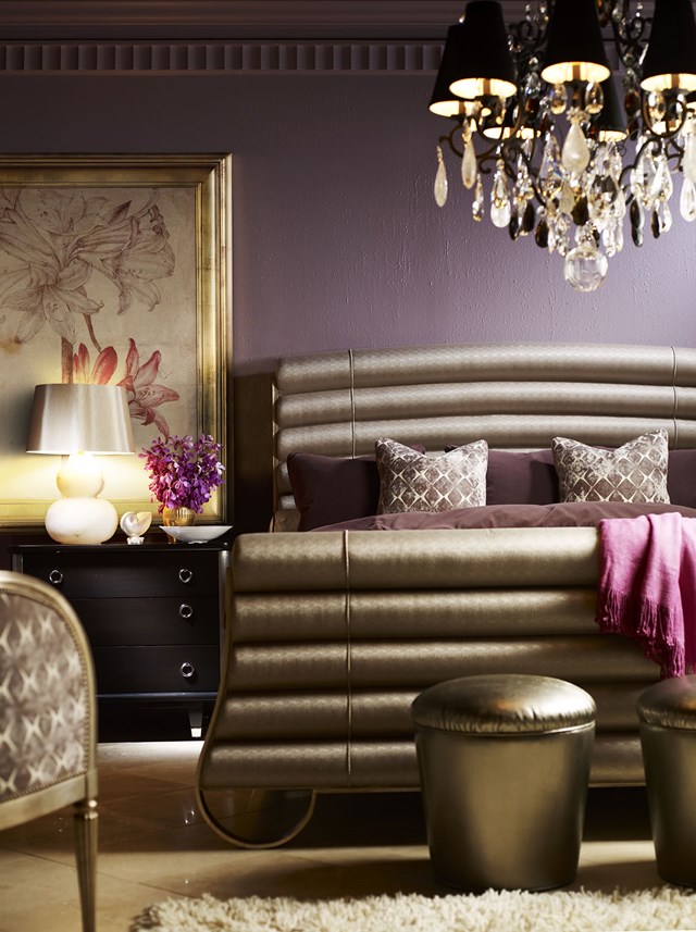
Go Monochromatic: Various hues of purple, including an easy stretch to silver, can be combined in unison to amazing effect. The bedroom from Chaddock designer Larry Laslo shown here is an amazing example. You absolutely see purple. This is a monochromatic room, but the neutral base is predicated on purple.
Pops of Purple: A wall-to-wall and floor-to-ceiling purple room is a commitment. It’s not for everyone. Imagine purple as an accent color. Kudos to Pantone because a live (or silk) orchid is always going to be a radiant choice. But there’s more: pillows, throws, artwork, crystal and glass.
New Wave Royalty: Purple is the color of royalty, especially paired with gold. But purple hues teamed up with silvers and grays are newer, fresher and more today. I’m hardly an insider, but I have to think this is how William and Kate would decorate.
Color is amazingly personal. We all see color differently. Colors shift with seasons, sunlight and mood. Today, colors that press boundaries – what I call colors that almost clash – transform interiors. My final piece of Radiant Orchid decorating advice is really about color in general. And that is, get help. A professional interior designer is also a color therapist and can help you bring color home – beautifully.
ABOUT MARK STUART: People impressed and inspired by the Robb & Stucky showroom often wonder where we get our ideas. Meet our creative mastermind (and color forecaster), Mark Stuart. As Robb & Stucky creative director, Mark is responsible for the floor plan and visual display of all Robb & Stucky stores. In his spare time, he also shops the world for accessories and engages with our amazing buying team on wood and upholstery selections so our stores enchant as a unified, beautiful experience.

