THINK PINK: Designing with Pink in 2016
January 25, 2016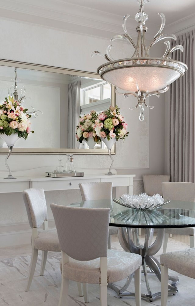
It all started with Robb & Stucky interior designer Ingrid de Villiers. Everyone knows that the Sand Dollar Awards are the Oscars for the building community in Southwest Florida. Late last year, Ingrid was awarded a perfect score for a Naples residence, and the home took away a coveted Sand Dollar – Interior Design of the Year amongst 1.75 to 2 million dollar homes. It’s amazing.
And it’s all about pink –
and well in advance of Pantone’s blushing ordination of Rose Quartz as the color of the year last month. The word is out. Pink is trending. Are you ready? As a recent convert, I’ll offer some decorating hints for designing with pink.
Robb & Stucky designer Ingrid de Villiers juxtaposes soft and bold shades of pink in perfect harmony.
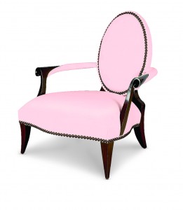
First, remember pink is not a single color. Pantone’s Rose Quartz is one hue among a heady bouquet. Think pink in a palette. An entire room bathed in cotton-candy would be a saccharine overload. Graduated and layered pinks – lavender to peony to fuchsia – come together in beautiful harmony. Indeed, harmony, serenity and calm are the essence of the palette – and the trend.
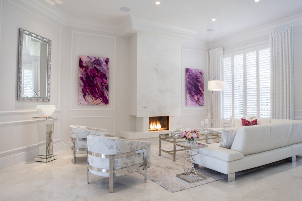
 Next, while developing a monochromatic all-pink palette may be a brilliant color strategy for some, you can certainly get creative with other color pairings. Pantone partnered Rose Quartz and Serenity Blue, but more diverse combos are also possible. Pantone color boards suggest a broad swath of hues: neutrals, ruddy earth tones, and even stronger, more saturated colors.
Finally, get your glow on with pink. Let it shine. Pearlize your pink. Introduce crystal, mirrored finishes, silver and chrome to your accessorization mix. Pink is destined to shine.
Pink is on the brink. Pantone says so, and Robb & Stucky’s Ingrid de Villiers essentially broke the story last year. Intrigued? Make it monochromatic, experiment with companion colors, and remember the metallics. Think pink. If courage fails, call Ingrid or your favorite interior designer!
ABOUT MARK STUART: Robb & Stucky Creative Director Mark Stuart is responsible for the floor plan and visual display of all Robb & Stucky stores. In his spare time, he also shops the world for accessories and engages with our amazing buying team to ensure Robb & Stucky stores enchant as a unified, beautiful experience.